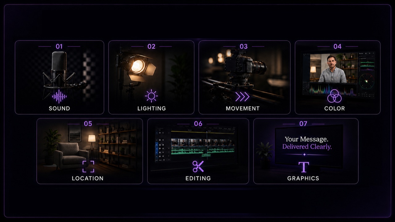
Two videos with the same runtime and a similar budget can read as premium or amateur for reasons that have almost nothing to do with the camera. Here is what actually signals production value.
Clients often describe what they want in terms of the camera: "can we shoot on the same camera as [big brand]'s video?" It is an understandable question, and also the wrong one. The gap between a video that looks expensive and one that looks amateur is rarely the camera body. It is a handful of craft decisions that are easy to overlook if you are not the one making them for a living.
This matters beyond curiosity. If you are budgeting a project, comparing quotes, or reviewing a production company's reel, knowing what actually drives perceived quality helps you spend on the things that show up on screen and skip the things that do not.
It starts with sound, not picture
Audiences forgive imperfect picture far more readily than they forgive bad sound. A slightly soft shot still reads as professional if the dialogue is clean. Crisp 4K footage with muddy, echoey, or inconsistent audio reads as amateur almost instantly, often before a viewer consciously registers why.
Good audio means dialogue that sits at a consistent, comfortable level across cuts, minimal room echo and background noise, and a mix where music and sound design support the voice rather than competing with it. None of that requires exotic gear. It requires someone on set whose only job is audio, and a mix pass in post that gets real attention rather than a quick pass at the end.
Lighting is the difference between "shot" and "captured"
Two setups in the exact same room can look completely different depending on how the light is shaped. Flat, even light from an overhead fixture reads as a webcam call. Light with intention, key and fill balanced, some shape and shadow, a clean separation between subject and background, reads as a production.
This does not automatically mean more lights or a bigger budget. It means someone looked at the space and made deliberate choices about where light comes from and what it is doing to the subject's face and the depth of the frame, instead of just turning on whatever fixture was already in the room.
Camera movement should feel intentional, not accidental
Handheld footage is not inherently a problem. Plenty of premium work is deliberately handheld for a specific creative reason. The tell is whether the movement feels chosen or incidental. A slow, controlled push, a stabilized glide, or a purposeful handheld energy during an interview all read as decisions. Wandering, drifting, or unstable footage reads as someone who did not have the right support gear or the experience to hold a shot steady.
Stability and camera support (sliders, gimbals, tripods, or simply a well-trained operator) are one of the more direct places where crew experience becomes visible on screen.
Color consistency matters more than a specific "look"
A distinctive color grade is nice to have. Consistency is not optional. If skin tones shift between cuts, if one interview looks warmer than the next, or if footage from different cameras or locations does not match, the inconsistency is what breaks the illusion, even for viewers who could not describe color grading if asked.
A proper color pass makes every shot in a sequence feel like it belongs to the same world. That is a post-production step, not a shooting one, and it is one of the easiest things to shortcut under time pressure, which is exactly why it is a reliable tell.
Locations and what is actually in the frame
A location does not need to be expensive to look good. It needs to be controlled. A cluttered background, visible cables, mismatched furniture, or a space that clearly was not prepped for camera reads as unplanned, regardless of how good the lighting or camera work is. A simple space that has been cleaned up, framed thoughtfully, and lit to complement the subject can outperform a fancier location that was not prepped at all.
This is one of the places where pre-production and on-screen production value connect directly. Our guide to why pre-production is where production value is won goes deeper into the planning side of this.
Pacing in the edit does a lot of invisible work
An edit with a clear rhythm, cuts that land on purpose, pacing that matches the energy of the content, reads as confident. An edit that lingers too long on a static shot or cuts abruptly for no reason reads as unfinished, even if every individual shot in it looks great.
Pacing is also where story structure and production value overlap. A well-paced edit makes a viewer feel like they are being guided somewhere, not just watching footage in the order it was captured.
Graphics and titles are a quiet giveaway
Typography, lower thirds, and motion graphics are one of the fastest ways to spot the gap between a template and a designed system. A default title template with a stock font reads as generic. Custom-designed titles that match the brand, animate with intention, and stay legible without cluttering the frame read as considered. Viewers rarely notice good graphics consciously. They notice bad ones immediately.
None of this is really about money
Every one of these markers is a decision, not necessarily a budget line. A larger budget usually buys more time to make good decisions on more shots, better gear that makes good decisions easier to execute, and specialists (a dedicated audio operator, a colorist, a motion designer) instead of one person doing everything. But a lean, well-run production applying these principles will consistently look better than a bigger production that skipped them. Our corporate video cost guide breaks down where that budget actually goes if you want the fuller picture.
Using this when you're evaluating a production company
If you are reviewing reels or comparing proposals, these are the things worth watching for directly, rather than asking about camera models or resolution specs. Listen to the audio first. Watch how consistent the color is across cuts within the same project. Notice whether the camera movement feels chosen. Look at whether the graphics feel designed for that brand specifically or reused from a template. Our guide on what to know before hiring a video production company covers the rest of that evaluation process.
Final thought
Production value is a set of specific, learnable craft decisions: sound, light, movement, color, space, pacing, and design, made deliberately instead of by default. None of it requires the most expensive gear on the market. It requires a team that knows which decisions actually show up on screen and treats each one as worth getting right.
Want a second opinion on a script, a shot list, or a rough cut before it's locked? Contact Cloud Gate Productions and we will help you spot the decisions that matter most for your project.