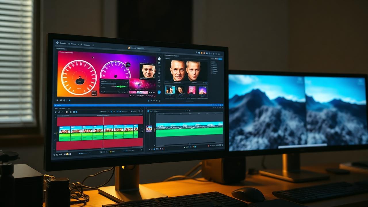
Master the art of color grading to create consistent, professional-looking footage that supports your story.
Color grading is where your footage truly comes to life. The right color palette evokes emotions, establishes visual identity, and transforms raw footage into polished content that captivates audiences.
Understanding the difference between color correction and color grading proves essential. Color correction fixes technical issues: balancing exposure, matching shots, and achieving neutral whites. Color grading creates mood and style through creative color choices. Always correct before grading.
White balance establishes the foundation. Properly balanced footage shows whites as neutral without color casts. Shoot with custom white balance or gray cards for accurate starting points. Fixing white balance in post wastes time and degrades image quality.
Exposure and contrast shape dimensional images. Proper exposure maintains detail in highlights and shadows. Contrast ratio—the difference between darkest and brightest areas—adds depth and visual interest. Use waveform scopes to ensure legal broadcast levels.
Color wheels provide primary grading controls. Adjust shadows, midtones, and highlights independently. Lift controls brighten or darken shadows. Gamma adjusts midtones where most image information resides. Gain affects highlights. Balance these controls for cohesive images.
Secondary color correction isolates specific colors or areas. Select skin tones, skies, or specific objects for targeted adjustments. HSL qualifiers enable precise selection based on hue, saturation, and luminance values.
LUTs (Look-Up Tables) apply color transformations instantly. Camera LUTs convert log footage to viewable images. Creative LUTs provide starting points for stylized looks. Use LUTs as foundations, then refine with additional grading.
Color psychology guides creative decisions. Warm tones (reds, oranges, yellows) feel energetic and inviting. Cool tones (blues, greens) seem calm or melancholic. High saturation suggests vibrancy and youth. Desaturated palettes feel serious or nostalgic.
Consistency across shots maintains visual continuity. Match exposure, color temperature, and saturation between shots in the same scene. Use reference stills and scopes to ensure shots cut together seamlessly.
Film emulation creates cinematic aesthetics. Study classic films to understand how color establishes mood and style. Analyze color palettes, contrast ratios, and grain structure. Replicate these elements to achieve film-quality results.